Data Science #5: Model Assessment

The performance of a prediction model consists of different indicators describing the analytical value. In this variety of concepts and metrics some are even mutually exclusive. For instance, a higher accuracy might be approached by a more complex and hence, less comprehensible and more time-consuming model.

In the following section, the focus will be set on accuracy as key performance indicator.
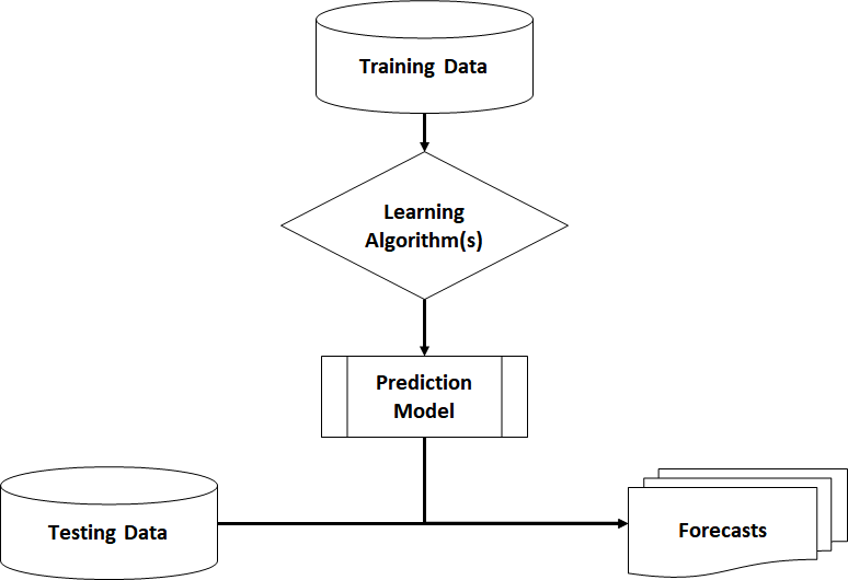
Validation Methods

As you already know, it makes hardly any sense to train a model on a data set and use exactly the same data for validation or accuracy measure (“resubstitution estimate”). Your learning algorithm could reach an accuracy of 100% just by learning the whole data set by heart (overfitting). If you then apply the trained model on new data, it is likely to fail making good predictions.

Resubstitution Estimate

The performance of a resubstitution estimate model is given by traditional statistical information critera. For instance, the Akaike Information Criterion (AIC) and the Bayesian Information Criterion (BIC) consider the Likelihood function (training error) and the complexity of the model. Ceteris paribus, these criteria will choose the model with lower complexity (number of variables).

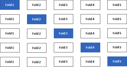
When building predictive models, you should not only rely on traditional statistics, but also on more modern techniques. In order to find the best fit for the model, it is highly recommended to partition your data set into a specific training data set and a testing/validation data set (“split sample method”). The testing set should contain around 20% of the original data. Hence, the learning algorithm trains on 80% of the cases and does not touch the testing set at all.

Split Sample Validation
Split Sample Method

Repeating the split-sample approach several times with different combinations of training/test sets leads to an even better accuracy approximation of your model. The data is split into k folds and one at a time is used as the validation set (“k-Fold Cross-Validation”). State-of-the-art machine learning packages provide this important technique.

k-Fold Cross Validation

Statistical Measures

From now on, I will assume that the k-Fold Cross-Validation is the standard validation method used to calculate certain measures.

1. Regression Models

The regression model with \(\small{ N }\) observations and \(\small{ I }\) columns/variables is

\[\displaystyle{y}_{{n}}=\beta_{{0}}+\beta_{{1}}{x}_{{n}}{1}+\cdots+\beta_{{i}}{x}_{{n}}{i}+ε_{{n}}\]

or in matrix notation

\[\displaystyle{y}={X}\beta+\varepsilon\]

Let \(\small{ \hat{y} }\) denote the fitted value (or prediction value) of \(\small{ y }\) given the estimates \(\small{ \hat{\beta}_{{{1}..{i}}} }\) of \(\small{ {\beta}_{{{1}..{i}}} }\) .

Then

\[\displaystyle{\hat{y}}=\hat{\beta} _{{0}}+\hat{\beta}_{{1}}{x}_{{1}}+\cdots+\hat{\beta}_{{i}}{x}_{{i}}\]

or in matrix notation, the vector of fitted values \(\small{ \hat{y} }\) is calculated by the \(\small{ \displaystyle{N}\times{I} }\) matrix (with \(\small{ N }\) observations and \(\small{ I }\) features) times the vector of estimates \(\small{ \hat{\beta} }\)

\[\hat{y}=X\hat{\beta}\]

with the residuals (error terms)

\[\displaystyle{\varepsilon}=\hat{y}-{y}\]

In order to get a better understanding of the error terms, I visualised a data set with blood pressure depending on the age of a person. The library ggplot2 provides powerful graphs for visualisation.

#create coordinates for our data frame df
   ggplot(df, aes(x=Age,y=Blood_Pressure)) + 
      #add data points y~x
         geom_point(color="black") +  
      #add regression line
         geom_smooth(method='lm', se=F, color="#d83c2d") +
      #add vertical arrows
         geom_segment(aes(x = Age, y = Blood_Pressure, xend = Age, yend = fitted(model)),
         color="#4e4e4e", size=0.4, arrow = arrow(length = unit(0.2, "cm")))

This R code gives the following plot:

Linear OLS Regression

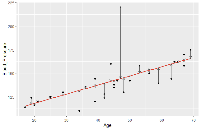
The error terms are visualised by the vertical arrows. It becomes obvious that a model does have a better fit if the data points are closer to the estimated regression line. Comparing different regression models, we take a closer look on these error terms. Since the sign of our \(\small{\varepsilon_{n} }\) can be positive or negative, we usually square it.  Hence, let us denote the mean square error of a regression model with \(\small{ n }\) observations as

\[MSE=\frac{1}{N}\sum_{n=1}^{N}\left({\hat{y}}_n-y_n\right)^2\]

This measure can now be compared between different regression models. We assume, that smaller MSE tend to achieve a better prediction accuracy.

2. Classification Models

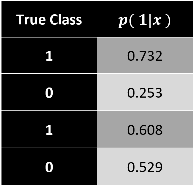
In comparison to regression, a classification model predicts a discrete target variable, e.g. 0 or 1. However, learning algorithms will give you a probability for each class and now it’s up to the data scientist to choose a threshold parameter (or cut-off point) \(\small{\omega\ \epsilon\ (0\ ,\ 1) }\).

Brier Score

In this case, we can apply a measure that we already know. Analogous to the mean square error (MSE) in regression models, the Brier Score calculates a classification MSE based on probabilities.

\[Brier\ Score=\frac{1}{N}\sum_{n=1}^{N}\left[p\left(class_j|x_n\right)-y_n\right]^2\]

The accuracy of a classification assesses how well your model has split your objects (data points) into the predefined target groups. It is obvious that a good model classifies new data with as little classification error as possible. Errors occur when your model classifies false positive or false negative values.

\[Classification\ Error=\frac{false_{positive}+false_{negative}}{number\ of\ objects}\]

The results of your classification model are often presented in a confusion matrix with a chosen cut-off rate (e.g. \(\small{ \omega=0.6)}\).

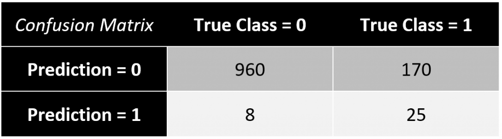
In this example, the classification error equals to \(\small{ 17.49\% }\).

\[\frac{8+170}{960+25+8+25}=\frac{178}{1018}\approx17.49\%\]

A drawback of this measure is a limited explanatory power, since you only consider a single guess of the cut-off rate \(\small{ \omega }\) based on your training data. Therefore, I want to introduce the Receiver Operating Characteristic Curve (ROC curve). It’s a more sophisticated way to assess your prediction model considering all possible cut-off rates. The ROC curve plots the false positive rate (\(\small{ 1-specificity }\)) on the \(\small{ x }\)-axis and the true positive rate (\(\small{ sensitivity }\)) on the \(\small{ y }\)-axis.

ROC Curve with two models in comparison

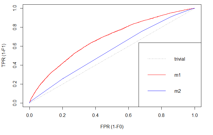
There is always a naïve benchmark in classifying objects into two groups. By the law of large numbers, a completely random classifier will reach a correct classification of \(\small{ 50\% }\). Thus, we only consider prediction models that are better than this benchmark. Otherwise it would be better to apply no model at all and just do random guessing.

Of course, we are interested in those models that differ significantly in correct classification from the trivial result. The blue line shows a logistic regression model and the red line is a decision tree. Both lines are above the trivial benchmark. The sweet spot in this graph lies at (\(\small{ x=0, y=1 }\)) which is the top left edge. At this point the model is almost perfect. Under real world circumstances, this point will never be reached, but the model can come extremely close.

Comparing \(\small{ m1 }\) (decision tree) and \(\small{ m2 }\) (logit model), the ROC curve indicates better results with the decision tree. That is, because this line is above the other.

Area under the ROC curve (AUC)

While comparing plots can be quite hard and inefficient, the ROC curve can be represented in a single measure.  By computing the area under the ROC curve (AUC) we still have the information which curve lies above the other, since this area will be greater, but we also have a complete summary within just one numeric value. The AUC of different models can easily be compared by humans or machines.

Data Science #4: Data Preprocessing

The first thing when obtaining new data is getting familiar with the structure. That is for instance, the meaning, scaling and distribution of variables, the number of observations and potential relationship or dependencies between columns or rows. General measures of statistics (mean, median, interquartile range) can be useful.

Data Selection

The selection of data depends on the business question or the objective of the model. If possible, the raw data should be as clean as possible. In general, the more observations you can get, the more possibilies you will have in the modelling process. You can always select a sub-sample. However, if you have only few observations to train your model on, then you might accept certain limitations of the resulting model.

Cleaning Data

Before training any model, it is vital to reduce noise in the data set. This noisiness is caused by errors, missing values or outliers. Hence, the detection and a proper treatment influences the outcome of your prediction significantly. Concerning errors in your data, so far we can say: Correct the error values if feasible or else treat them as missing values as follows.

Missing Values

One of the first things during data preprocessing is identifying missing values. We can simply achieve this by finding empty cells in our tabular data df:

sapply(df, function(x) sum(is.na(x)))

Sometimes it might not be as easy as finding empty cells depending on the data source. Often missing values are decoded by the researcher with some specific value (e.g. “9” or “999”). Useful commands in R to identify those values are

table(df$columnX)

and

hist(df$columnX)

While dealing with missing values the data scientist can follow different approaches. If there is a large data set with only few missing values, it might be comfortable to just delete all incomplete observations.

df <- na.omit(df$columnX)

However in most cases this cleaning method is unsuitable because too much information is lost. Sometimes even missing values have a special meaning. In this case we could add a dummy variable containing the information whether a value was missing or not.

df$newDummyCol = ifelse(is.na(df$columnX),1,0)

After storing this information, the column with the missing values can be edited. The data scientist makes use of various imputation techniques. That is estimating the missing values and filling in a proper estimate for every single observation. A very naïve strategy would be replacement by the mean or median of the complete observations.

df$columnX[is.na(df$columnX)] = mean(df$columnX[!is.na(df$columnX)])

More sophisticated methods are linear regressions or decision trees based on the other features/variables

regr =lm(columnX~colY+colZ, data=df[!is.na(df$columnX),])
df$columnX[is.na(df$columnX)]=predict(regr, newdata = df[is.na(df$columnX),])

There are also some packages that can do this process very conveniently.

Outlier Detection

Outlying values are a big issue in data preprocessing. Here, we speak of values that are located far too distant from most other observations. Thus, they might have a misleading effect on the predictions and cause biases or high variance.
The detection of outliers can be obtained by visualisation using histograms or boxplots and by numerical approaches. A simple z-transformation helps to standardise/normalise the data in order to get a better overview on the distribution

\[z_j=\frac{x_j-\mu}{\sigma}\]

where \(\small{ \mu }\) is the mean and \(\small{ \sigma }\) the standard deviation. In R we apply this by

df$columnX = standardize(df$columnX)

We assume that outlying values have z-values larger than 3 or smaller than -3.
Another numerical method to detect outliers is the squared Mahalanobis distance. In addition to the previous z-transformation, the squared Mahalanobis distance does also consider the depending or surrounding variables in context. Hence, this is an even better technique.

\[D^2\ =\ \left(x_j\ -\ \mu\right)^\prime\mathrm{\Sigma}^{-1}\ \left(x_j\ -\ \mu\right)\]

with the covariance matrix \(\small{ \mathrm{\Sigma} }\).

The treatment of outliers resembles the missing value treatment. If these outliers are no errors, it might be possible to keep them in the data set. Otherwise imputation techniques like mean replacement or linear regression can be applied. In some cases, it might even be sensible to exclude the outlying observations.

Data Transformation

Now having a nice clean data set, you should still not start building your prediction model.  Depending on the model type you are using, the transformation of certain variables is necessary in order to increase the performance and accuracy levels of predictions.

Feature Scaling

When it comes to different algorithms, you as a data scientist must consider different requirements. Many models use the Euclidean distance measure between two data points. Hence, they struggle with different scaling of the variables. Especially machine learning algorithms (e.g. k-nearest-neighbors) can reach much better performances when the features are normalised/standardised.

Models that use linear or logistic regression follow the Gauss-Markov-theorem and will (by definition) always give the best linear unbiased estimator (BLUE). That is giving weights to the features automatically. In other words, we don’t have to scale our variables when using linear or logistic regression techniques, but it helps the data scientist to interpret the resulting model. With normalised features, the interpretation of the intercept will be the estimate of \(\small{ y }\) when all regressors \(\small{ x_i }\) are set to their mean value. The coefficients are now in units of the standard deviation. Furthermore, scaling can reduce the computational expense of your model training.

Another set of algorithms, that are completely unaffected by scaling of features are all tree-based learners. But even when you use a decision tree, there is a good reason for normalising your data: You leave the door open to add other learning algorithms for comparison or ensemble learning.

Unsupervised Binning/Distrecisation

The process of aggregating data into groups of higher level of abstraction is called binning (for two groups) or discretisation (for more than two groups). Based on their value, the data is put into classes representing hierarchies. For instance, a person’s height is a continuous variable and can be assigned to dicrete groups “small”, “medium” and “large”. Although some information is lost in this process, you achieve a much cleaner data set with less noise. In most cases, you achieve a more robust prediction model. The number of groups can be chosen by the data scientist.

library("recipes")
d = discretize(df$columnX, cuts=3, min_unique=0, na.rm=TRUE)
df$columnXdiscr = predict(d, new_data = df$columnX)

Supervised Discretisation

The term “supervised” is always the hint for labelled data (including the outcome or target value). As an initial step, the target variable can be used to discretise a feature. This method can be used in order to maximise the information gain of discretisation for your prediction.

Feature Engineering

The topic of feature engineering is essential for modern machine learning. It is both difficult and expensive, since the data scientist needs to perform most part of it manually. Our goal is to change or create new features with a higher explanatory character than the raw data could offer.

In most cases, lots of experience and theoretical background are needed in order to understand the relationship between different variables.

a. Aggregations

The simplest way of feature engineering is a basic aggregation of data. That can be obtained by discretisation techniques (already mentioned above).

b. Transformation of Distribution

There are different famous transformation techniques in order to change the distribution of the data. Assume a variable contains both small numeric values and some large values. Here, we can apply a simple log-transformation to lower the larger values and hence tighten the distribution. Another example is the Box-Cox-transformation.
Often the goal is to achieve a more normal distribution, since many learning algorithms (e.g. Regression) need that normal assumption.

c. Trend variables

When it comes to time series, an important feature can be the marginal difference between two data points. This can give us an absolute trend \(\small{ \frac{x_t-x_{t-i}}{i} }\) or a relative trend \(\small{ \frac{x_t-x_{t-i}}{x_{t-i}} }\).

d. Weight of Evidence (WOE)

The weight of evidence (WOE) is a powerful transformation of a discrete (categorical) feature into a numerical measure describing the good or bad influence of this category on the target variable (information value).

\[WOE_i=\ln{\left(\frac{p\left(GOOD\right)_i}{p\left(BAD\right)_i}\right)}\]

where

\[p\left(GOOD\right)_i=\frac{absolute\ number\ of\ GOODs\ in\ category\ i}{total\ number\ of\ GOODs\ in\ all\ categories\ 1..i}\]

On the training data we can calculate the WOE in R using the library InformationValue:

#load library
library(“InformationValue”)

#calculate and add column of WOEs on labelled data set (train data)
df$columnXwoe=WOE(df$columnXdiscr, df$target, valueOfGood = 1)

#calculate and store WOE table to merge with unlabelled new data
woe.table.colX=WOETable(df$columnXdiscr, df$target, valueOfGood = 1)

Remember to store the WOETable for later merging with unlabelled new data sets:

tmp=as.data.frame(df$columnXdiscr)
colnames(tmp)="CAT"
tmp$row=rownames(tmp)
tmp2=(merge(tmp, woe.table.colX))
tmp2$row=as.numeric(tmp2$row)
df$columnXwoe =tmp2[order(tmp2$row),]
remove(tmp,tmp2)

Feature Selection

It is often not to difficult to create a large variety of features and transformations of the data. However, in the end the best transformation techniques might add only little explanatory power to the machine learning model. Therefore, a proper selection of features needs to be performed before building the model with too many (maybe unimportant) features. The curse of dimensionality is often mentioned in this context. The more different features we add to our model, the more dimensions are used and hence the model becomes more complex. The problem of a more complex model can be a high variance when applying it. Another difficulty of many features is the cost of time and computing power for training the model.

A proper set of features can be obtained by different approaches:

a. Filter Approach

A statistical indicator for variable importance is given by a high (or at least moderate) correlation between a feature and the target variable. Depending on the scaling of the variables, a suitable correlation measures is taken into account (e.g. Pearson, Fisher,…).

The filter approach assesses only one feature at a time and does not consider the interaction between different explanatory features. Therefore, the filter approach is less effective than the following method.

b. Wrapper Approach

A more considerate way to select features is the wrapper approach, that also considers the relationship between the all selected features. This is done iteratively by comparing all possible \(\small{ 2^{n}-1 }\) models containing up to a maximum of \(\small{ n }\) explanatory variables.

The selection can be achieved by forward, backward or stepwise selection. For instance, the forward selection starts with only one feature and iteratively adds one more feature which adds the most explanatory power to the model. This process is stopped as soon as a predefined threshold of marginal accuracy added to the model is not passed anymore.

Using the wrapper approach usually gives a better performance, but also takes more computational cost.


Data Science #3: Predictive Modelling

Prediction Models are built on data of the past. A common application is observing a customer’s attributes and behaviour in order to predict whether he will return a purchased item or keep it. Before a model can make such a prediction, it needs to learn from past data that include the outcome label (target variable). After that training process, the model is able to make predictions based on new unlabelled data (=target variable is missing).

Predicitive Analytics: A prediction model is trained with the training data and tested with the testing data.

Predictive Algorithms

1. Regression Models

Linear or non-linear regression algorithms make predictions/forecasts by calculating a model with a continuous dependent target variable.
Typical business cases are sales predictions or financial forecasts.

2. Classification Models

Classification algorithms classify objects into known groups. (Remember: Groups were unknown in cluster analysis). For instance, a dichotomous target variable might be the risk of credit default (1=default, 0=repayment). At the point of loan application, the outcome is not yet known. However, classification models can make a prediction based on the characteristics/attributes of the applicant (object).

Decision Trees

A decision tree is a set of splitting rules that predicts discrete (classification) or continuous (regression) outcomes. It can be visualised as directed tree-like graph starting from a root node, including various splitter nodes and ending with the possible outcomes (leaves).

I want to show you two simple examples of decision trees. First, a classification decision tree that classifies the passengers of the Titanic into two groups: survivors and fatalities.

The second type of decision trees describes a regression model. For instance, take a look at the average income of a person based on different attributes.

Building a Decision Tree

When creating a decision tree, it is our ambition to increase the impurity of the data. That is looking for “good splits” that reduce the impurity and avoiding splits that only fit for few data points.
To measure impurity \(\small{ I\left(N\right) }\) of some node \(\small{ N }\), there are several common choices to take. Two often used impurity criteria are the Entropy \(\small{ I_E\left(N\right) }\) and the Gini Index \(\small{ I_G\left(N\right) }\).

Entropy:

\[I_E\left(N\right)=-\sum_{j=1}^{c}{p_j\log_2{(p_j)}}\]
Gini Index:

\[I_G\left(N\right)=1-\sum_{j=1}^{c}p_j^2\]

\(\small{ p_j=p(y_j|N) }\) denotes the proportion of data points that belongs to class \(\small{ c }\) for node \(\small{ N }\) . The Gini Index can reach a maximum of \(\small{ max{\ I}G\left(N\right)=0.5 }\) and with Entropy \(\small{ max{\ I}_E\left(N\right)=1 }\). Using the impurity criteria, we can now derive a new measure that indicates the goodness-of-split:

The Information Gain Criterion \(\small{ IG\left(N\right) }\) is the weighted mean decrease in impurity and is denoted as

\[IG\left(N\right)=I\left(N\right)-p{N1}\ast\ I\left(N_1\right)-p_{N2}\ast\ I\left(N_2\right)\]
To find the best split, a comparison of \(\small{ IG\left(N\right) }\) to all other possible splits is required.

Pseudo-Code for Building a Decision Tree

Input:
 S	//Set of data points   

Algorithm:
 Start from root node with all the data
 Repeat:
   1.	For each variable find the best split
   2.	Compare best splits per variable across all variables
   3.	Select best overall split and optimal threshold
   4.	Split tree and create two branches
 Until: No further improvement is possible

Output:
 Decision Tree

Algorithms of decision trees tend to build their models very close to the training data and sometimes “learn it by heart”. As already mentioned, this will lead to bad predictions on new testing data. We call this overfitting. Therefore, it is vital to apply stopping criteria on the tree growing. The model applies “pre-pruning” if it does not fully grow the complete decision tree and it applies “post-pruning” it first grows fully the tree and then cut branches that do not add much information.


Data Science #2: Descriptive Analytics

The first branch of knowledge discovery in data bases is the field of descriptive analytics. In this section, I will set the focus on clustering algorithms.

Cluster Analysis

The cluster analysis is a powerful tool often used in marketing to identify homogeneity or certain similarities within data sets. The aim is to create (sub-)groups with as much homogeneity within these groups and as much differentiation between the segments as possible:

  • maximal intra-cluster homogeneity
  • maximal inter-cluster heterogeneity

Clustering Algorithms

The hierarchical clustering approach uses iterative algorithms to form cluster solutions. You can either start with one huge cluster and then iteratively split them into smaller ones (divicive) or you begin with a bottom-up approach, that is having every data point in one’s own cluster and then iteratively merge cases into larger clusters.

Here, the focus is set on a non-hierarchical, exclusive, clustering algorithm: K-Means

The K-Means-algorithm is very popular and assigns every case to exactly one cluster. Let’s have a look at the algorithm in pseudo code:

Input:
K 	//number of clusters
DP[1..n]	//Set of n DataPoints   

Algorithm:
Randomly choose k objects of DP as initial cluster centroids
Repeat:
   1. Assign all remaining n-k cases to the cluster with most similarity (least distance)
   2. Update: Calculate intra-cluster mean and choose (new) centroid which is closest to the mean.
Until: No more change in cluster assignment

Output:
Set of k clusters of n DataPoints

Finding the best k

The number of clusters is predefined by the data scientist. The more clusters we define, the better will be the segmentation of this data. In the extreme scenario, every data point is assigned in a new cluster. However, a model that has learned the training data “by heart” is not suitable for new data, because there is too much noise included.
Literature states that a lack of generalisation leads to bad predictions on new data. Therefore, it is necessary to find the sweet spot (k*) with a low error rate on the one hand and enough level of abstraction for new testing data.

Elbow-Curve

A graphical approach to estimate k* is the so-called Elbow-curve. By plotting the total within-cluster Sum of Squares (error terms) against the number of clusters k, we get this nice curve that often reminds of an elbow. The best setting for k lies directly in the elbow.


Data Science #1: Business Analytics

Business Analytics encompasses the utilization of large-scale data sets, commonly referred to as “big data,” and state-of-the-art computer-based statistical techniques to equip company management with valuable information about their customers and provide insights into overall business operations. This multidisciplinary field, often synonymous with data science, deploys historical data to generate descriptive or diagnostic analytics and construct predictive models using supervised learning algorithms. These forecasts facilitate decision-making and optimization processes in businesses.

Big Data: High Volume, Variety, Velocity, and Veracity

When discussing Big Data, we refer to information assets characterized by high volume, variety, velocity, and veracity. These attributes render traditional database systems and computational models inadequate for extracting the full value of such data.

The Business Analytics Process

Knowledge Discovery in Databases

The process of business analytics can be segmented into several stages, with the initial step typically involving the formulation of a business question that can be addressed through statistical modeling. For example, identifying two products that are frequently sold together to optimize marketing budget allocation. As a data scientist, your role would involve identifying and collecting the necessary data to address the task at hand. This can prove challenging, depending on a company’s technological infrastructure.

In most cases, the data may not be ready for analysis due to issues such as missing values or outliers. After cleaning the data set and ensuring the appropriate scaling of features, the data can be subjected to analysis. This may entail either descriptive or predictive analyses.

Ultimately, the primary objective of business analytics is to derive actionable insights. By interpreting model results, business analytics assists in making informed managerial decisions, thereby contributing to the company’s overall success.