The performance of a prediction model consists of different indicators describing the analytical value. In this variety of concepts and metrics some are even mutually exclusive. For instance, a higher accuracy might be approached by a more complex and hence, less comprehensible and more time-consuming model.
In the following section, the focus will be set on accuracy as key performance indicator.
Validation Methods
As you already know, it makes hardly any sense to train a model on a data set and use exactly the same data for validation or accuracy measure (“resubstitution estimate”). Your learning algorithm could reach an accuracy of 100% just by learning the whole data set by heart (overfitting). If you then apply the trained model on new data, it is likely to fail making good predictions.

The performance of a resubstitution estimate model is given by traditional statistical information critera. For instance, the Akaike Information Criterion (AIC) and the Bayesian Information Criterion (BIC) consider the Likelihood function (training error) and the complexity of the model. Ceteris paribus, these criteria will choose the model with lower complexity (number of variables).
When building predictive models, you should not only rely on traditional statistics, but also on more modern techniques. In order to find the best fit for the model, it is highly recommended to partition your data set into a specific training data set and a testing/validation data set (“split sample method”). The testing set should contain around 20% of the original data. Hence, the learning algorithm trains on 80% of the cases and does not touch the testing set at all.

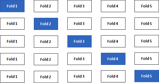
Repeating the split-sample approach several times with different combinations of training/test sets leads to an even better accuracy approximation of your model. The data is split into k folds and one at a time is used as the validation set (“k-Fold Cross-Validation”). State-of-the-art machine learning packages provide this important technique.

Statistical Measures
From now on, I will assume that the k-Fold Cross-Validation is the standard validation method used to calculate certain measures.
1. Regression Models
The regression model with \(\small{ N }\) observations and \(\small{ I }\) columns/variables is
\[\displaystyle{y}_{{n}}=\beta_{{0}}+\beta_{{1}}{x}_{{n}}{1}+\cdots+\beta_{{i}}{x}_{{n}}{i}+ε_{{n}}\]
or in matrix notation
\[\displaystyle{y}={X}\beta+\varepsilon\]
Let \(\small{ \hat{y} }\) denote the fitted value (or prediction value) of \(\small{ y }\) given the estimates \(\small{ \hat{\beta}_{{{1}..{i}}} }\) of \(\small{ {\beta}_{{{1}..{i}}} }\) .
Then
\[\displaystyle{\hat{y}}=\hat{\beta} _{{0}}+\hat{\beta}_{{1}}{x}_{{1}}+\cdots+\hat{\beta}_{{i}}{x}_{{i}}\]
or in matrix notation, the vector of fitted values \(\small{ \hat{y} }\) is calculated by the \(\small{ \displaystyle{N}\times{I} }\) matrix (with \(\small{ N }\) observations and \(\small{ I }\) features) times the vector of estimates \(\small{ \hat{\beta} }\)
\[\hat{y}=X\hat{\beta}\]
with the residuals (error terms)
\[\displaystyle{\varepsilon}=\hat{y}-{y}\]
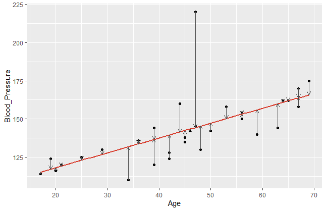
In order to get a better understanding of the error terms, I visualised a data set with blood pressure depending on the age of a person. The library ggplot2 provides powerful graphs for visualisation.
#create coordinates for our data frame df
   ggplot(df, aes(x=Age,y=Blood_Pressure)) +
      #add data points y~x
         geom_point(color="black") +
      #add regression line
         geom_smooth(method='lm', se=F, color="#d83c2d") +
      #add vertical arrows
         geom_segment(aes(x = Age, y = Blood_Pressure, xend = Age, yend = fitted(model)),
         color="#4e4e4e", size=0.4, arrow = arrow(length = unit(0.2, "cm")))
This R code gives the following plot:

The error terms are visualised by the vertical arrows. It becomes obvious that a model does have a better fit if the data points are closer to the estimated regression line. Comparing different regression models, we take a closer look on these error terms. Since the sign of our \(\small{\varepsilon_{n} }\) can be positive or negative, we usually square it. Hence, let us denote the mean square error of a regression model with \(\small{ n }\) observations as
\[MSE=\frac{1}{N}\sum_{n=1}^{N}\left({\hat{y}}_n-y_n\right)^2\]
This measure can now be compared between different regression models. We assume, that smaller MSE tend to achieve a better prediction accuracy.
2. Classification Models
In comparison to regression, a classification model predicts a discrete target variable, e.g. 0 or 1. However, learning algorithms will give you a probability for each class and now it’s up to the data scientist to choose a threshold parameter (or cut-off point) \(\small{\omega\ \epsilon\ (0\ ,\ 1) }\).

Brier Score
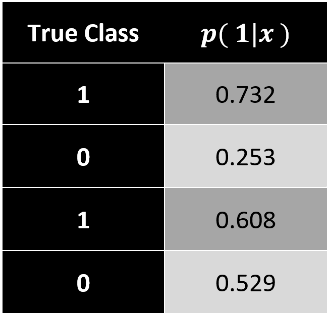
In this case, we can apply a measure that we already know. Analogous to the mean square error (MSE) in regression models, the Brier Score calculates a classification MSE based on probabilities.
\[Brier\ Score=\frac{1}{N}\sum_{n=1}^{N}\left[p\left(class_j|x_n\right)-y_n\right]^2\]
The accuracy of a classification assesses how well your model has split your objects (data points) into the predefined target groups. It is obvious that a good model classifies new data with as little classification error as possible. Errors occur when your model classifies false positive or false negative values.
\[Classification\ Error=\frac{false_{positive}+false_{negative}}{number\ of\ objects}\]
The results of your classification model are often presented in a confusion matrix with a chosen cut-off rate (e.g. \(\small{ \omega=0.6)}\).

In this example, the classification error equals to \(\small{ 17.49\% }\).
\[\frac{8+170}{960+25+8+25}=\frac{178}{1018}\approx17.49\%\]
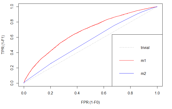
A drawback of this measure is a limited explanatory power, since you only consider a single guess of the cut-off rate \(\small{ \omega }\) based on your training data. Therefore, I want to introduce the Receiver Operating Characteristic Curve (ROC curve). It’s a more sophisticated way to assess your prediction model considering all possible cut-off rates. The ROC curve plots the false positive rate (\(\small{ 1-specificity }\)) on the \(\small{ x }\)-axis and the true positive rate (\(\small{ sensitivity }\)) on the \(\small{ y }\)-axis.

There is always a naïve benchmark in classifying objects into two groups. By the law of large numbers, a completely random classifier will reach a correct classification of \(\small{ 50\% }\). Thus, we only consider prediction models that are better than this benchmark. Otherwise it would be better to apply no model at all and just do random guessing.
Of course, we are interested in those models that differ significantly in correct classification from the trivial result. The blue line shows a logistic regression model and the red line is a decision tree. Both lines are above the trivial benchmark. The sweet spot in this graph lies at (\(\small{ x=0, y=1 }\)) which is the top left edge. At this point the model is almost perfect. Under real world circumstances, this point will never be reached, but the model can come extremely close.
Comparing \(\small{ m1 }\) (decision tree) and \(\small{ m2 }\) (logit model), the ROC curve indicates better results with the decision tree. That is, because this line is above the other.
Area under the ROC curve (AUC)
While comparing plots can be quite hard and inefficient, the ROC curve can be represented in a single measure. By computing the area under the ROC curve (AUC) we still have the information which curve lies above the other, since this area will be greater, but we also have a complete summary within just one numeric value. The AUC of different models can easily be compared by humans or machines.

